anni
projects:
01.
02.
03.
04.
05.
06.
07.
08.
lets talk:
Design
Creative Direction
Branding
Curation
Website
Social Media
Publication
Design
Print Management
Print & Digital Assets
Approach
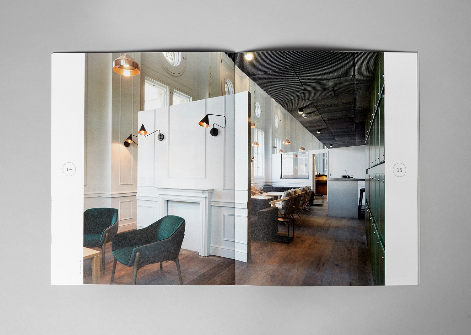
All things business, The Fold was commissioned by TOG (The Office Group) and branded with its own visual identity. The publication was created to connect and inspire businesses by telling the stories of innovative companies from their inception, through their strife, growth and good times. The publication not only showcases some familiar, on-trend faces already "making it" but also some of the one-man band start-ups and less renowned creatives making their mark.
Part of TOG’s ethos is a unique approach to each of their locations. A bespoke outlook rather than a one-size-fits-all, working in situ with the building's original architecture and bringing new life into the space. This crafted bespoke approach is mimicked in The Fold’s branding using a typically traditional serif typeface, nostalgic of business news but with a modernised twist for the masthead, paired with 2 additional typefaces. One highly stylised italic and one clean, modern sans serif. For the website, a similar approach was taken with expandable and collapsable spaces to allow for shifting content and engaging but simple movement.
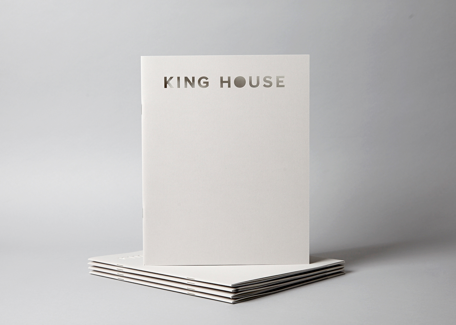
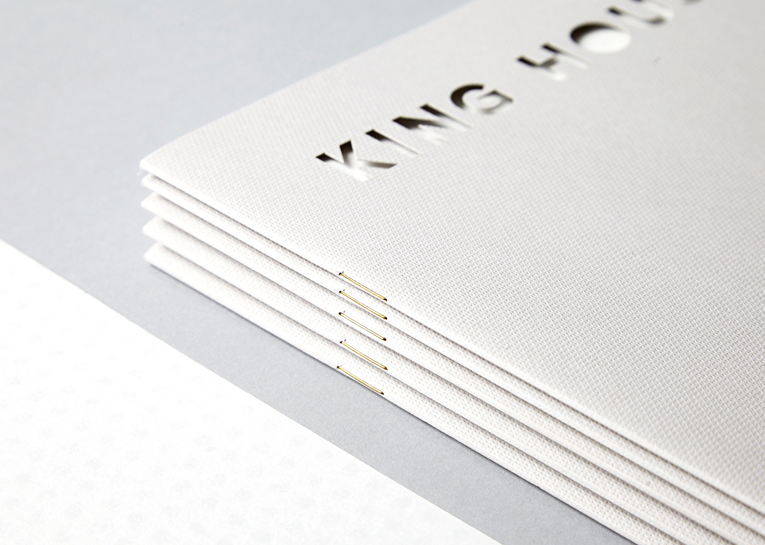
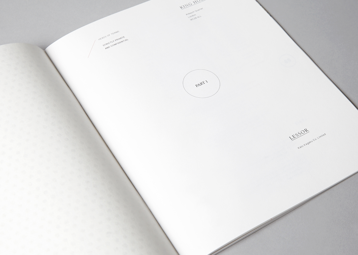
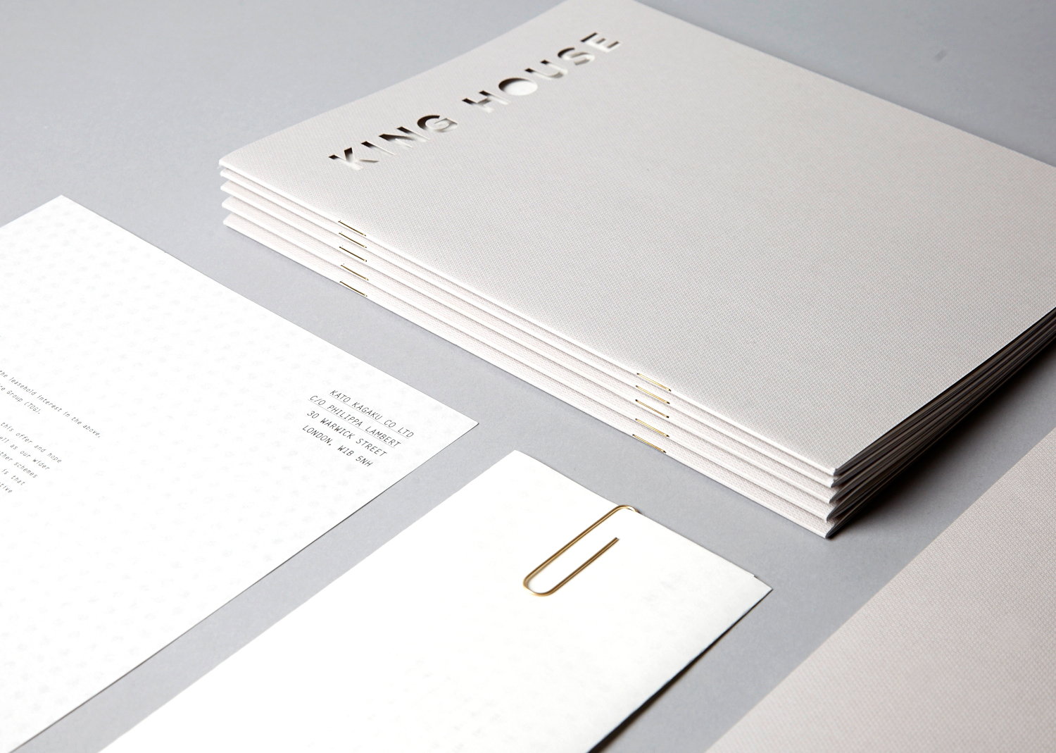
king house
Design
Pitch Design
Branding
Layout
Print
Print Management
Approach
A bespoke branding and pitch document for the acquisition of a new Japanese owned development in Soho.
Outcome
Coming soon
coming soon
last
nxt
up top