Approach
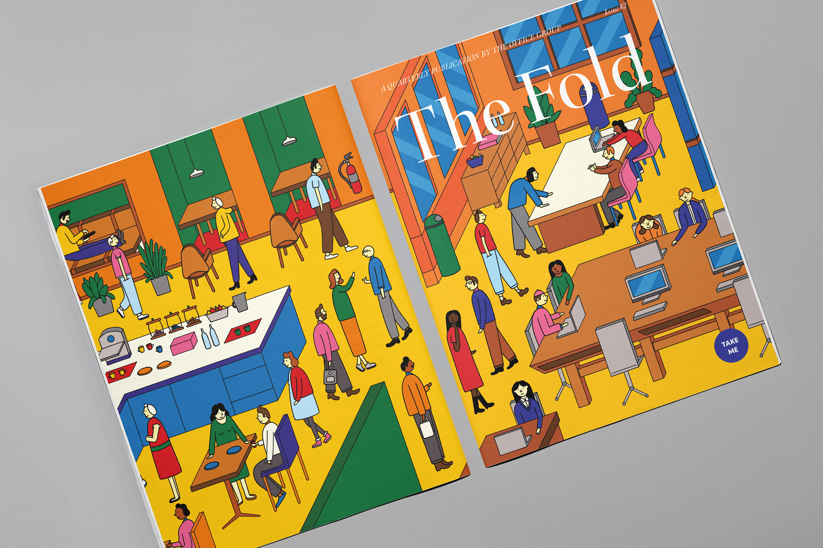
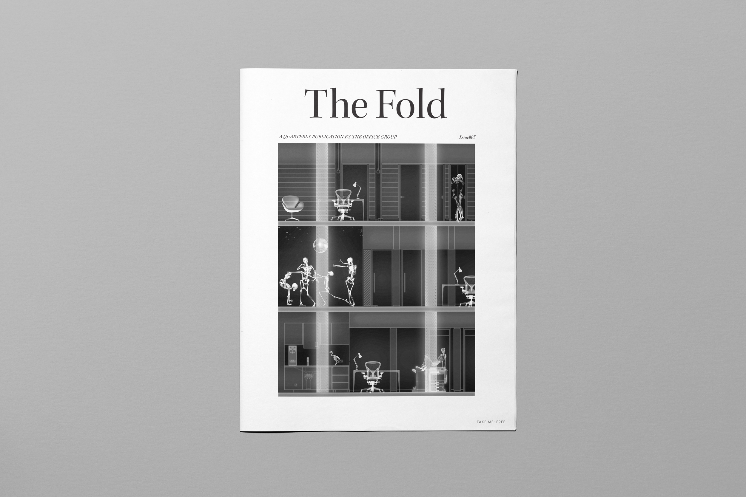
All things business, The Fold was commissioned by TOG (The Office Group) and given its own visual identity. The publication connects and inspires businesses by telling the stories of innovative companies — from inception through challenges, growth, and success. Reflecting TOG’s ethos of a bespoke approach to each location, the branding combines a traditional serif typeface, nostalgic of business news, with three complementary typefaces — a secondary serif, a stylised italic, and a clean sans serif — creating flexibility and a clear typographic hierarchy.
Outcome
It was an absolute hit, funding itself for several years through direct office rentals from the first release alone. In a less expected turn, a surprising number of people outside of TOG reached out to share how much they enjoyed the publication, demonstrating broader brand reach and awareness.