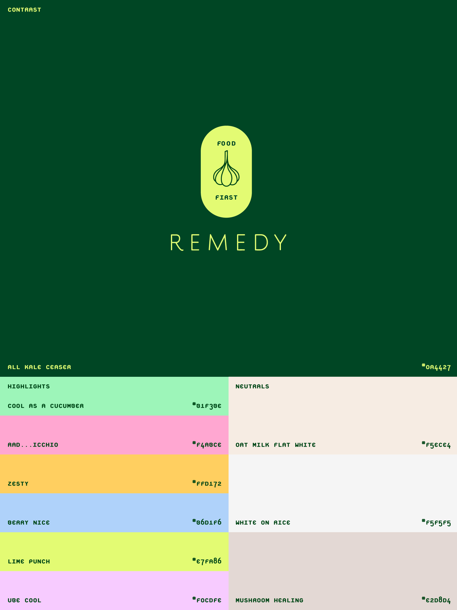
Design:

Creative Direction
Name Generation
Photography Styling  
Branding
Website
Social Media
Digital Assets
Print Collateral
Animation

Find balance
for better health

Approach:

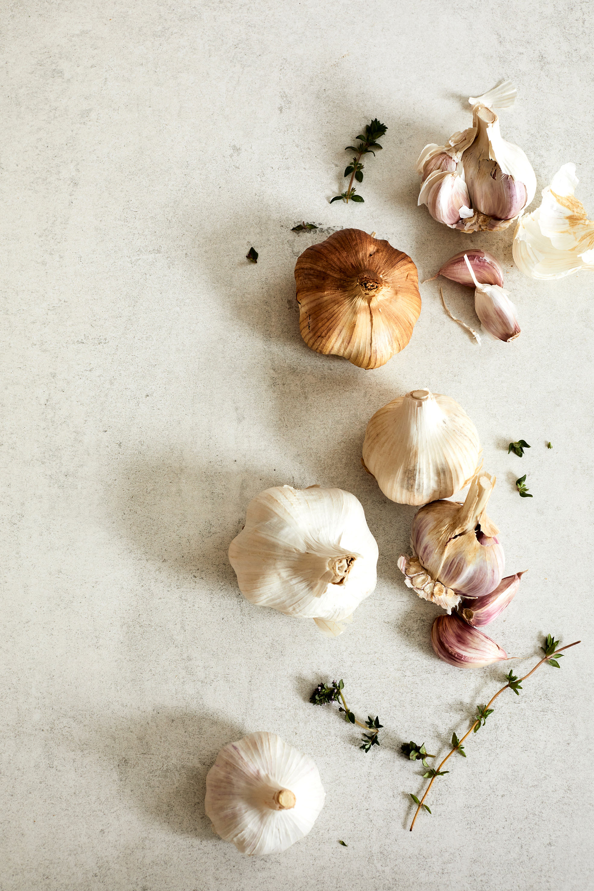
Charlotte Lucas is a nutritionist, pharmacist, and health coach championing science-led, food-first wellbeing. Inspired by her homegrown garlic — a symbol of food as medicine — her brand identity reflects a holistic approach to health.

Encased in a traditional pill shape, the logo symbolises food as medicine. This is paired with the six pillars of a healthier lifestyle, capturing the multifaceted, balanced nature of long-term wellbeing.

Outcomes

A warm, inviting, and educational brand shaped by strong creative direction and authentic photography. Designed as a highly adaptable and intuitive system, it evolves seamlessly alongside the brand’s growth while consistently reflecting Charlotte’s ethos.

Personable and relatable, the brand celebrates the beauty and significance of food — vibrant, fresh, and intentionally simple.

up top