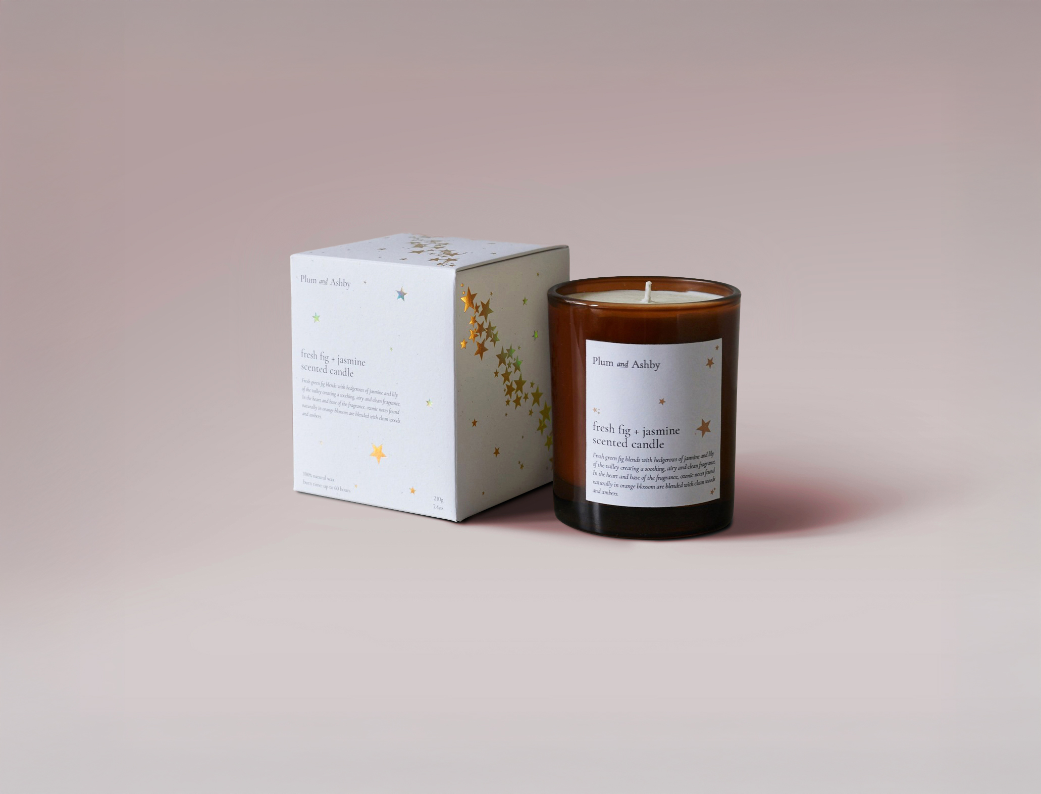
Approach
Capturing the nature and nostalgia of the British countryside by putting their scents and artisan formulations at the forefront of the products, allowing the fragrances to speak for themselves. Embracing a traditional apothecary aesthetic through the use of a classic serif typeface from the beautifully crafted Garamond family, chosen to reflect their artisanal processes.
Outcome
A strategic restructuring and simplification of the gift packaging resulted in a 50% reduction in costs, while the use of recycled craft paper with natural flecks added a tactile, premium feel. A redesigned Christmas Collection doubled seasonal sales, and the Wave of Light candle raised £45,000 for Tommy’s charity — featured in Hello Magazine and championed by Kate Middleton.